
 Understanding Color Theory
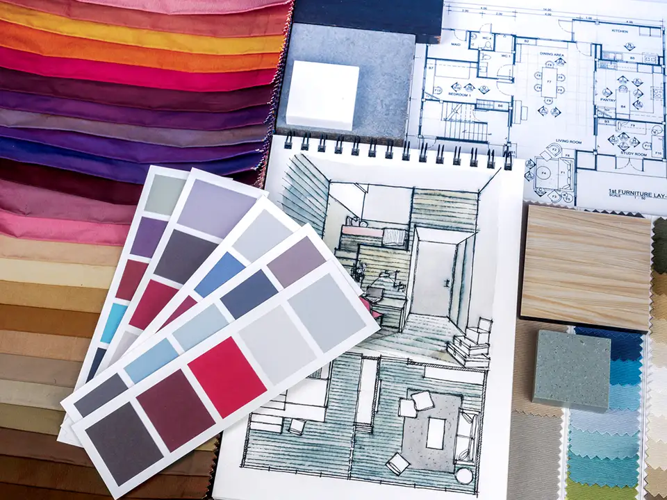
Color is one of the most powerful tools in interior design. It can transform a space, evoke emotions, and even influence behavior. Whether you’re redecorating a single room or planning an entire home, understanding color theory can help you make informed choices that reflect your personal style and enhance your living environment.
At its core, color theory is the study of how colors interact and affect perception. It includes several key concepts that can guide your design choices.
The Color Wheel
The color wheel is a visual representation of colors arranged by their chromatic relationships. It consists of three primary categories:
- Primary Colors: Red, blue, and yellow—these cannot be created by mixing other colors.
- Secondary Colors: Green, orange, and purple—formed by mixing two primary colors.
- Tertiary Colors: Created by mixing a primary color with a secondary color (e.g., red-orange, blue-green).
Understanding the color wheel can help you create harmonious color palettes. You can explore interactive color tools like the Adobe Color Wheel to experiment with combinations.
 Color Harmonies: Creating Balance in Your Space
Color harmonies are specific combinations of colors that create visual appeal. Here are some popular types:
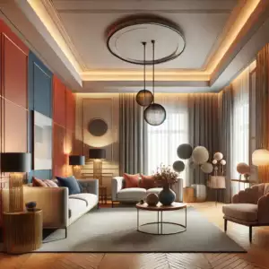
- Complementary Colors: Colors opposite each other on the wheel, such as blue and orange. These high-contrast combinations create dynamic, energetic spaces.
- Analogous Colors: Colors next to each other on the wheel, like blue, blue-green, and green. They create a serene and cohesive environment.
- Triadic Colors: Three colors evenly spaced around the wheel, such as red, yellow, and blue. This scheme maintains balance while offering vibrancy.
To test different harmonies in your space, consider using the Sherwin-Williams Color Visualizer, which allows you to preview color schemes before making a decision.
Warm vs. Cool Colors and Their Psychological Effects
Colors are often classified as warm or cool, and each can influence mood and perception:
- Warm Colors (Red, Orange, Yellow): These hues create energy, excitement, and warmth. However, bold reds may stimulate aggressive emotions.
- Cool Colors (Blue, Green, Purple): These shades tend to be calming and are great for relaxation spaces like bedrooms and offices.
Each color also has unique psychological associations:
- Blue evokes calm, trust, and peace, making it ideal for bedrooms and offices.
- Yellow is linked to happiness, optimism, and creativity but can be overwhelming in large doses.
- Green represents balance, harmony, and nature, making it a refreshing choice for living spaces.
- Purple symbolizes luxury, creativity, and spirituality, adding depth and sophistication.
For more insights on color psychology, check out the Pantone Color Institute, which sets global color trends.
Creating a Personalized Color Palette
Here are steps to help you build a cohesive color scheme:
- Start with a Base Color: Choose a neutral or foundational color for large areas, like walls or flooring.
- Add Accent Colors: Select one or two accent shades to bring personality and contrast.
- Incorporate Textures: Matte, glossy, and textured finishes can enhance color perception.
- Consider Lighting: Natural and artificial light can alter how colors appear. Use tools like the Phillips Lighting Guide to understand lighting effects.
- Be Mindful of Reflection: If you have a red oak floor, for example, its warm tones may reflect onto walls and furniture, shifting their appearance.
Final Thoughts
Understanding color theory is essential for creating a beautiful and functional home. By applying these principles, you can design spaces that enhance mood, showcase your personality, and maintain harmony.
Are you ready to start your color journey? Use tools like the Benjamin Moore Color Trends to explore the latest palettes and find inspiration for your space!